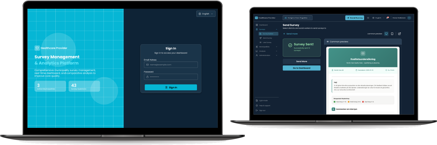
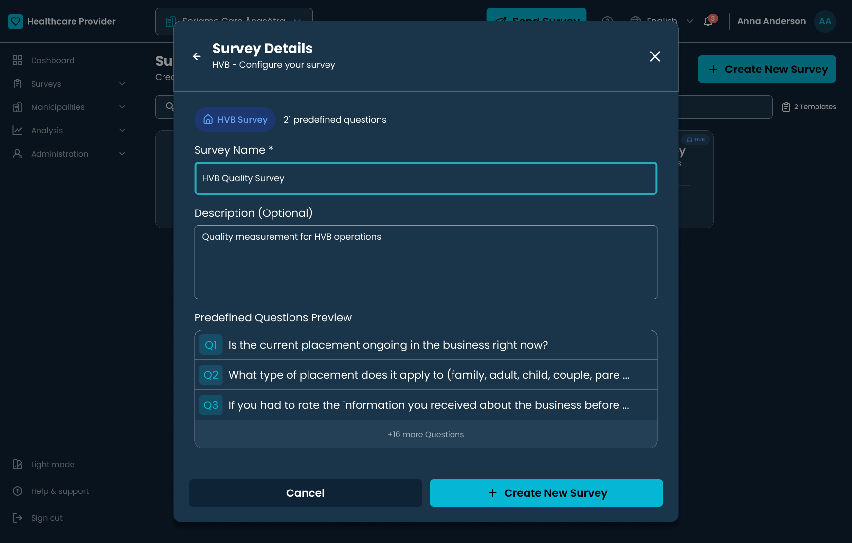
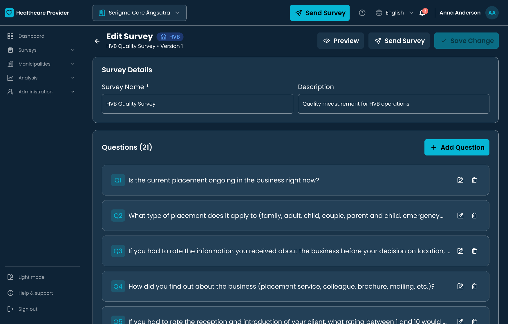
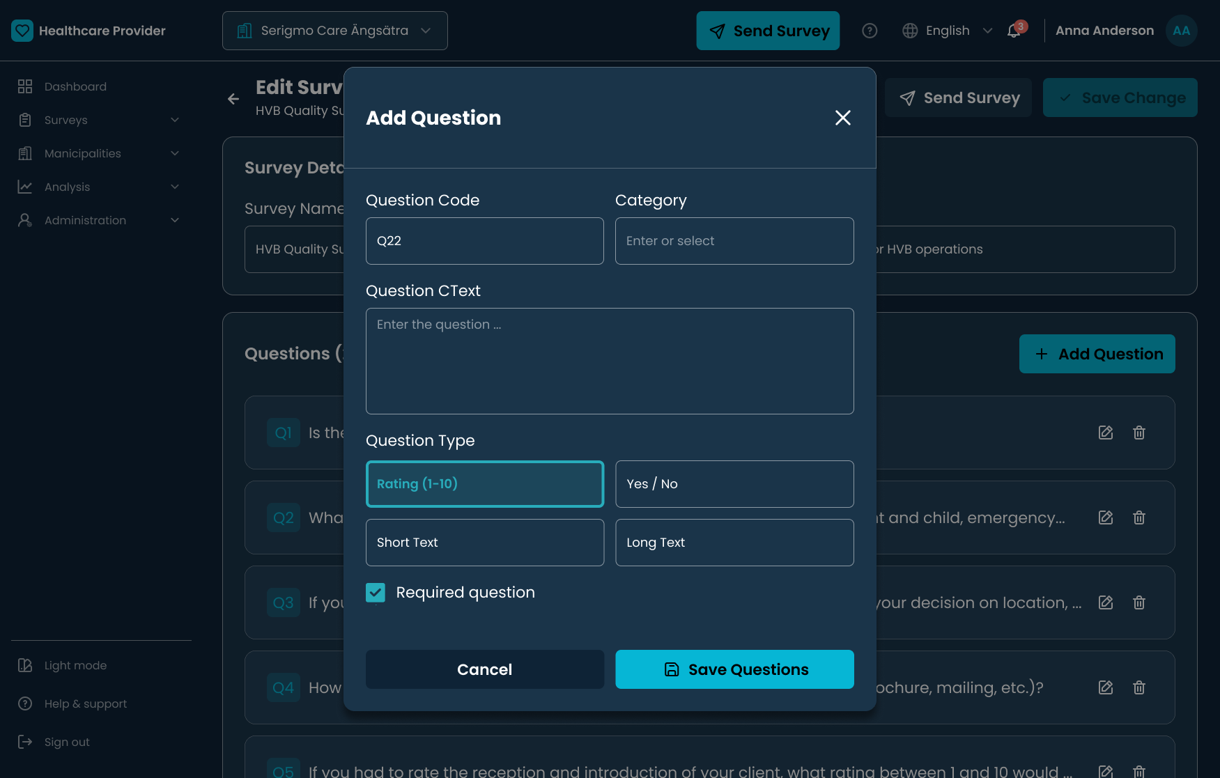
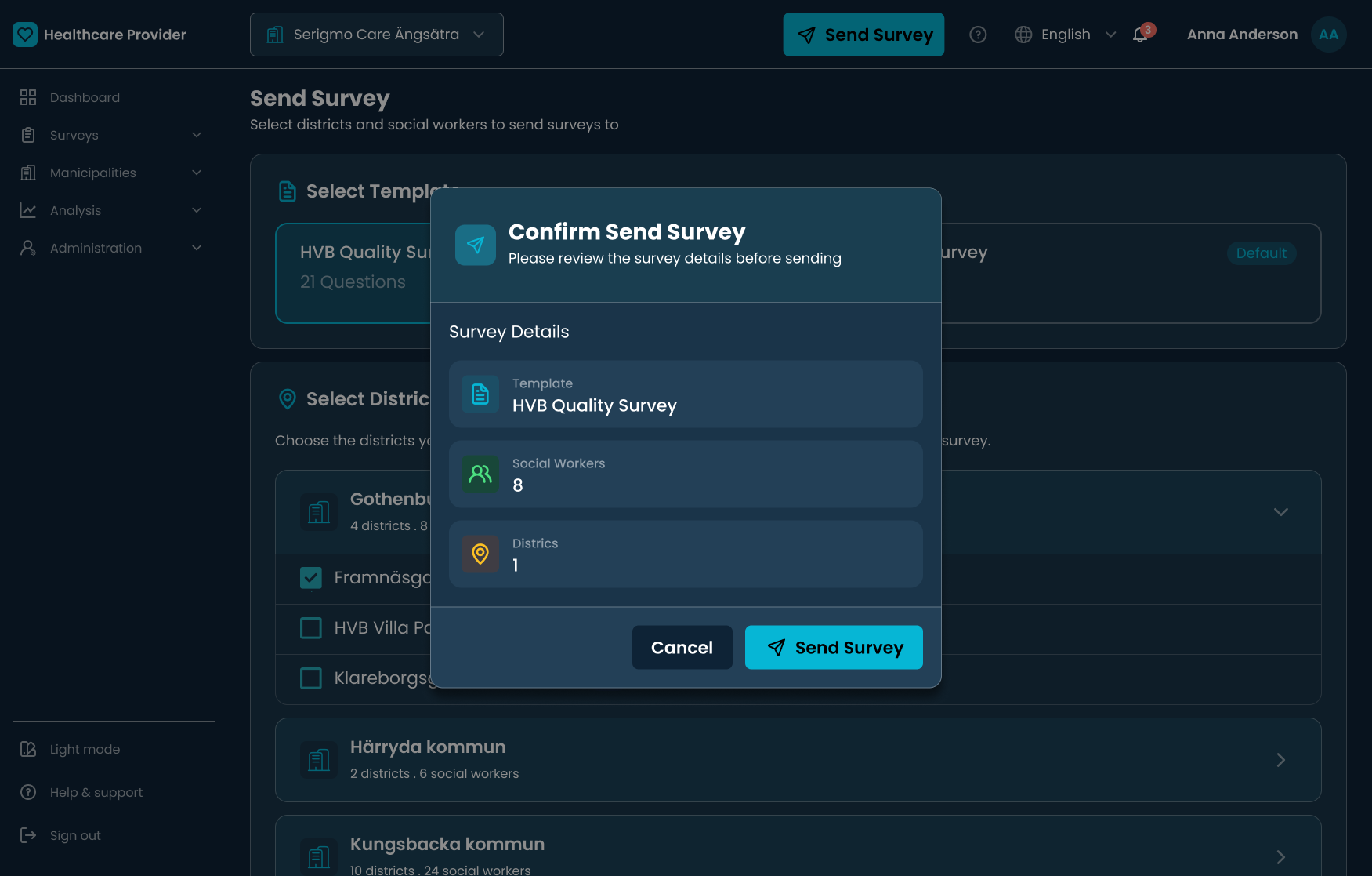
In Sweden, healthcare providers are required to send regular quality surveys to the municipalities they serve. It sounds simple — but the reality was anything but. Administrators were managing responses from 30+ municipalities using a patchwork of Outlook emails, Excel spreadsheets, and shared folder systems that were never designed to work together.
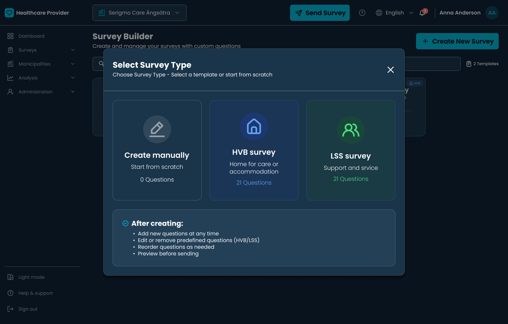
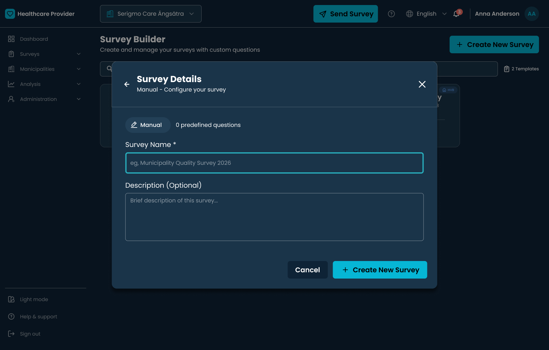
This project set out to design a B2B SaaS platform that consolidates the entire survey lifecycle — creation, distribution, real-time tracking, and analysis — into one place. The primary goal: cut administrative workload by 50% without sacrificing the quality of the data collected.
My Responsibilities
- Lead UX/UI Designer and front-end developer (implementation via Cursor AI)
- Stakeholder interviews with healthcare quality managers across Stockholm
- Workflow analysis mapping the full survey lifecycle end to end
- Information architecture for the complex Swedish healthcare hierarchy
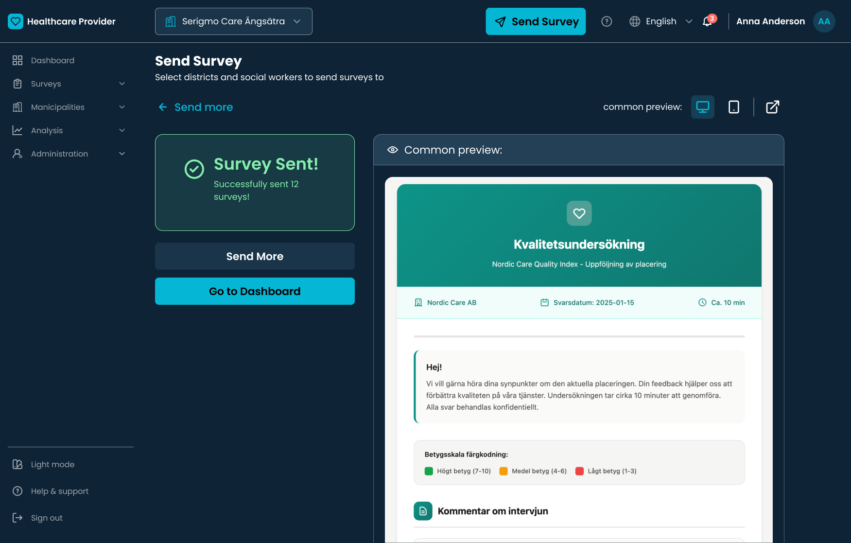
- Designing the guided 6-step "Power Send" distribution wizard
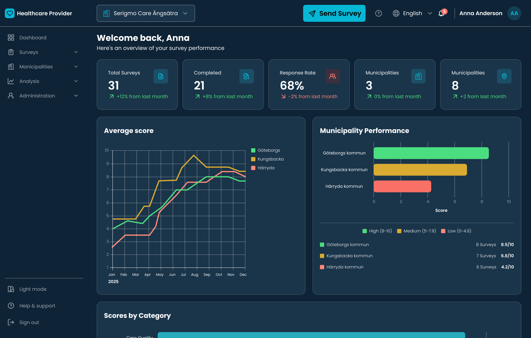
- Traffic-light performance scoring system for the municipality dashboard
- Moderated usability testing with 5 healthcare administrators
- WCAG accessibility compliance across mobile, tablet, and desktop
I ran lightweight but targeted research to understand how administrators actually experience the survey process — not how it looks on paper. The goal was to identify where time was being lost and why existing tools were consistently failing them.
🗣️
"We need to see long-term trends across municipalities — not just individual survey answers."
A · Stakeholder interviews with 4 healthcare quality managers
🗺️
Survey creation, distribution, tracking, and analysis were handled in entirely separate tools — with no handoff or continuity between them.
B · Workflow analysis mapping the full survey lifecycle end to end
📋
Existing spreadsheet templates showed heavy manual formatting and annotation — signs of a system stretched far beyond its intended purpose.
C · Document review of spreadsheets, email templates, and reporting docs
👀
Administrators switched between Outlook, Excel, and shared folders mid-task — sometimes losing their place and having to restart their entire tracking process.
D · Usability observation of existing manual workflows in real sessions
Before this platform existed, every survey cycle required administrators to coordinate across multiple tools simultaneously — with no visibility into the overall picture. The pain concentrated in three distinct areas.
01
Manual chaos
Surveys sent by email. Responses tracked in separate Excel files per municipality. Deadlines missed. Follow-ups done entirely by hand.
02
The black box
No central view of who had responded, who was pending, or which regions needed urgent follow-up. Progress was invisible to everyone.
03
Analysis fatigue
Quarterly reports required aggregating data manually from multiple spreadsheets — a process that routinely took two full weeks.
30+
Municipalities managed per administrator
8–10h
Hours per week lost to manual tracking
2 wks
To prepare a single quarterly report
"I spend more time chasing people for replies than actually analysing the quality of care."
— Healthcare Administrator, Stockholm
The map above traces how a quality manager moves through ten steps — from login and template setup through Power Send, monitoring responses, reminders, analytics, and final report submission. Peaks align with guided flows and clear feedback; the steepest dips mark manual recipient handling and the stretch where responses were effectively invisible in the old toolchain.
The platform had to handle complex Swedish healthcare hierarchies — providers, municipalities, districts, and individual social workers — without overwhelming users who are already stretched thin. Every design decision was oriented around reducing cognitive load at each step of the workflow.
01
Research & workflow mapping
Mapped the full survey lifecycle from creation through reporting. Identified three major bottlenecks: distribution setup, response tracking, and quarterly analysis.
02
Information architecture
Structured the platform into three clear sections — Surveys, Analysis, Reports — matching the mental model administrators already had for their day-to-day work.
03
Hierarchy design
Designed an accordion-based navigation system to surface the Provider → Municipality → District → Social Worker hierarchy progressively, one level at a time.
04
Wizard design
Created the 6-step "Power Send" distribution wizard to replace the error-prone manual process of selecting recipients, managing email lists, and reviewing send details.
05
Usability testing
Moderated task-based testing with 5 healthcare administrators. Uncovered a critical visibility issue with the "Select All" control and iterated to fix it.
06
Build with Cursor AI
Implemented the platform using Cursor AI with structured prompt engineering to enforce design consistency, accessibility standards, and handle complex nested data structures.
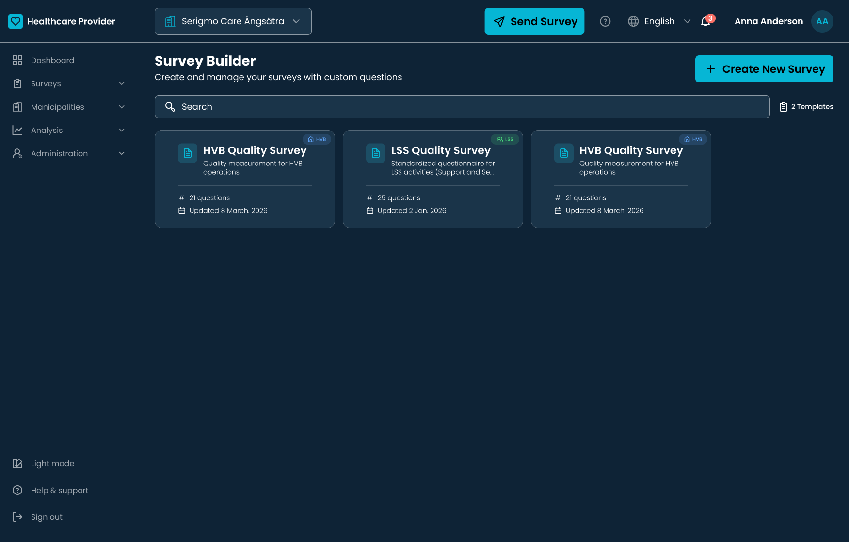
Accordion-based navigation system — reducing visual clutter across 30+ municipalities
The Swedish healthcare system has multiple administrative levels. Showing all of them simultaneously created long, impenetrable lists — the exact kind of overwhelming complexity that had eroded administrators' trust in digital tools before this platform existed.
| Level | Description | Design solution |
|---|
| Provider | Top-level healthcare organisation | Always visible in the persistent collapsible sidebar |
| Municipality | 30+ municipalities per provider | Accordion — expand on tap to reveal districts beneath |
| District | Sub-units within each municipality | Nested accordion, revealed one level at a time |
| Social Worker | Individual survey respondents | Only surfaced when a specific district is selected |
Before this platform, sending a survey to 30+ municipalities required selecting recipients manually, managing email lists, and reviewing everything across separate documents. One missed municipality could invalidate an entire reporting cycle.
I replaced this with a guided distribution wizard that breaks the process into six clear, linear steps — each one verified before the next becomes available.
01
Select survey
Choose the template to distribute to municipalities
02
Choose recipients
Filter and select municipalities from the hierarchy
03
Set language
Choose survey language per municipality or region
04
Set deadline
Define response deadlines for each recipient group
05
Review
Confirm all details before the survey goes out
06
Send
Distribute to all selected recipients simultaneously
The guided wizard reduced distribution errors and made the process faster for every administrator
Managers needed to assess healthcare performance across 30+ municipalities quickly — but dense tables of numbers were exhausting to read under time pressure. The solution: a colour-coded scoring system that communicates status at a glance, without any mental arithmetic required.
| Status | Meaning | Action |
|---|
| Good performance | Above target threshold across all key indicators | No immediate action needed |
| Needs attention | Approaching threshold — risk of falling below target | Monitor and schedule follow-up |
| Critical | Below acceptable threshold — requires immediate review | Escalate — intervene now |
I conducted moderated task-based testing with 5 healthcare administrators who regularly manage survey workflows. Each participant was asked to create a survey and distribute it to multiple municipalities — a direct reflection of their real day-to-day work.
🔍
Users had difficulty locating the "Select All" option when selecting districts from long hierarchical lists. Most selected items one by one — not from habit, but because the button wasn't visually discoverable.
Key issue identified · Select All button — low contrast, poor placement in the interface
Before iteration
~8 min
Average time to select all districts. "Select All" was small, low-contrast, and consistently missed by participants.
✓ After iteration
~5 min
30% faster. Button repositioned, contrast improved, selection counter added. All 5 participants found it immediately.
"Now I can actually see what I've selected. Before I was never sure if I'd got everyone."
— Healthcare Administrator, Usability Testing Session
The three headline improvements below are based on a combination of usability testing task timing, workflow analysis comparing the old manual process to the designed platform, and estimates provided by healthcare administrators during research sessions. They represent the projected impact of the full platform at scale, not post-launch analytics.
1
From 2 hours to ~15 minutes — survey creation
In the original workflow, creating and distributing a survey required composing individual emails, attaching documents, and logging recipients manually. The 6-step wizard reduced this to a guided, single-session flow. Timing was measured during usability testing with 5 administrators completing the same task on both the manual workflow and the prototype.
2
Select All iteration — 30% faster municipality selection
A specific, validated improvement from usability testing: the "Select All" button for district selection was initially low-contrast and frequently missed. After repositioning and improving contrast, average task time dropped from ~8 minutes to ~5 minutes across the same 5 participants.
3
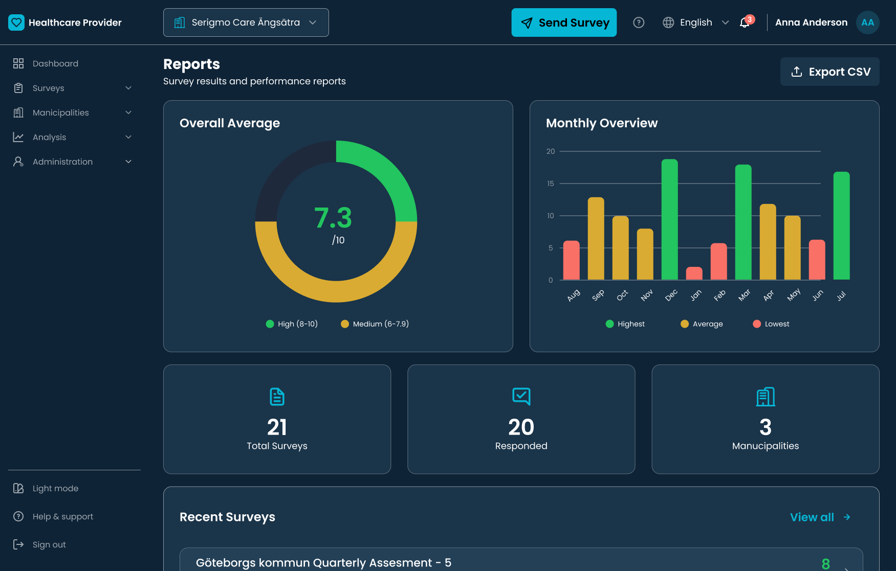
Quarterly reports: from 2 weeks to real-time
Administrators estimated spending up to two weeks per quarter manually compiling response data from spreadsheets. The analytics dashboard aggregates responses in real time, making the reporting step near-instant. This is an administrator estimate validated during research interviews, not yet measured post-launch.
The platform replaced a fragmented, error-prone manual workflow with a single centralised system. Administrators went from managing 30+ separate email threads to having a real-time view of every municipality's response status — with instant report generation replacing two weeks of spreadsheet aggregation.
01
Good UX organises complexity — it doesn't hide it
The hierarchy problem wasn't solved by flattening the structure. It was solved by revealing it progressively, one level at a time, so each step felt manageable rather than overwhelming.
02
Guided flows build confidence in high-stakes environments
Healthcare administrators aren't tech-averse — they're risk-averse. A wizard that verifies each step before moving forward gave them the confidence that nothing would fall through the cracks.
03
AI-assisted development changed what one designer can ship.
Using Cursor AI for front-end implementation didn't mean handing off control — it meant I stayed in control of every detail while moving faster. I wrote detailed prompts that specified exact spacing, colour tokens, accessibility requirements, and component behaviour. When the output didn't match the spec, I debugged through the prompt, not through guesswork. The result was a fully built, WCAG-compliant platform designed and implemented by one person. That's a different kind of design skill — and one I'm actively developing.