Grocery App
Internal project at Focalpay
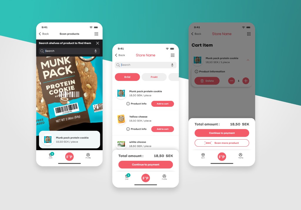
This was an internal project at Focalpay — a companion shopping app for grocery stores already running on the Focalpay ecosystem. The brief was clear: make in-store shopping feel faster without making it feel rushed. I focused on three moments that matter most — scanning a product, browsing the catalog, and reviewing the cart — and stripped everything else back. Contrast ratios were checked at every step to meet WCAG AA, and tap targets were sized for real hands in a real store, not just a design tool preview.
The teal and gray palette was a deliberate choice. It reads as fresh and trustworthy — right for a food context — without falling into the tired greens that dominate grocery branding. The result is an interface that feels like it belongs in the store, not on top of it.