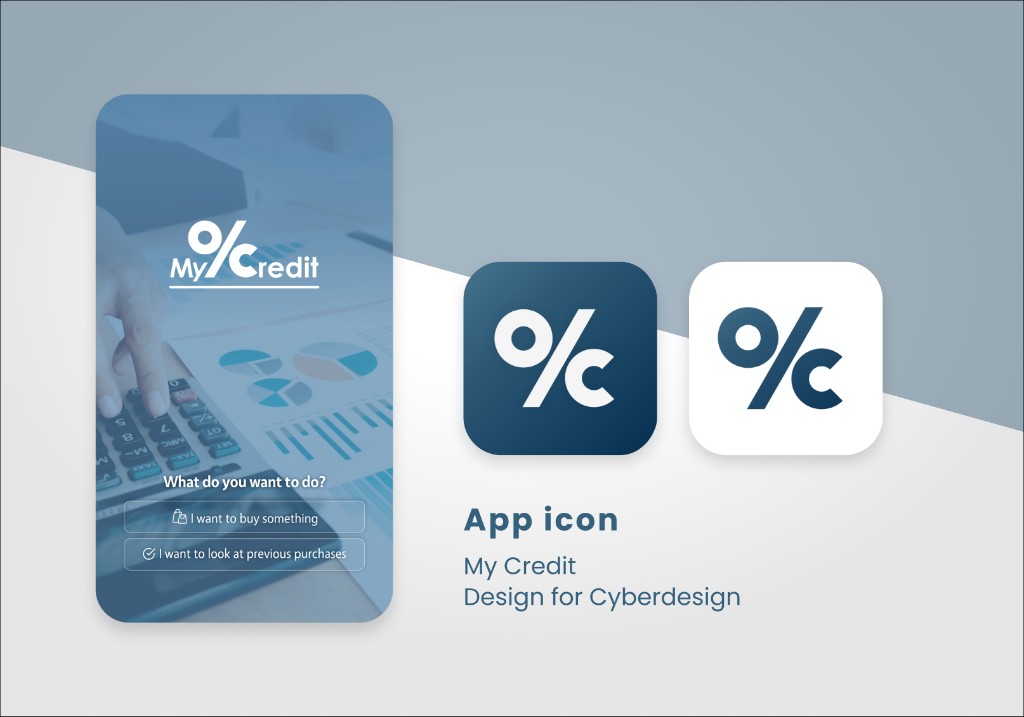
My Credit — App Icon & Launch Screen
Brand mark via Cyber Design AB
Designed through Cyber Design AB, the My Credit app icon had one job: communicate "personal finance" without looking like every other fintech app. The solution was a paired icon system — one filled percentage mark, one outlined — sitting together as a mark. The pairing creates a sense of balance and duality that subtly references credit (what you have vs. what you owe) without spelling it out.
The deep navy over soft blue-gray was a deliberate trust signal. Finance apps live or die by how credible they feel at a glance, and this palette earns that credibility before a user has read a single word. The icon was designed to work at every scale — from the App Store listing down to a 20px notification badge — so pixel-level legibility was checked throughout the process.