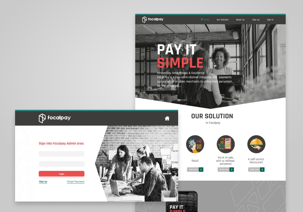
Focalpay Website
Dual-audience marketing site for Focalpay
The Focalpay marketing website had a dual audience problem: it needed to speak to new merchants who had never heard of the product, while also serving as the entry point for existing clients logging in to the admin panel. These two needs pull in different directions — one wants to be sold to, the other wants to get in and get on with things. The design handles both by giving the landing page a clear, conversion-focused flow and keeping the sign-in screen clean and frictionless.
Working within Focalpay's established teal and red brand system meant the visual decisions were more about refinement than invention. The focus was on spacing, typographic hierarchy, and making sure the page communicated the product's value proposition quickly — because in B2B, you have about eight seconds before someone decides whether to keep reading.