Retail Rewards Rush
Loyalty Challenge Experience
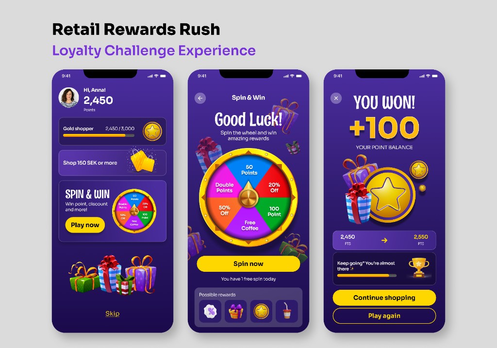
A gamified loyalty experience designed to make everyday shopping feel rewarding. The challenge was taking a familiar retail app context and injecting the visual energy of a mini-game campaign — without it feeling cheap or disconnected from the brand.
Color & Contrast
Deep purple (#2D1A6B) paired with gold (#FFD700) creates a contrast ratio that passes WCAG AA on all interactive elements, while the pairing itself does something more important: purple signals premium and exclusivity; gold signals reward and achievement. Neither color is accidental. White text on the darkest purple backgrounds was tested at every screen size to ensure legibility under typical retail lighting conditions — bright stores, users glancing quickly.
Typography
A heavy display weight was used for reward moments (“YOU WON!”, “+100”) to create a clear typographic event — something the eye lands on immediately. Body text and mission labels stay in a clean regular weight to let the numbers breathe. The size jump between the reward figure and supporting text is intentional: hierarchy isn’t just about size, it’s about telling the user where to look first, second, and third.
Visual Hierarchy & Engagement Mechanics
Every screen has one primary action and one reward signal. The home screen leads with points (identity), then mission (urgency), then spin wheel (temptation). The spin screen strips everything away except the wheel and the CTA — no distractions when the moment of play arrives. The win screen inverts the hierarchy entirely: the reward number dominates, and the next action (“Continue shopping”) comes only after the celebration lands.
Some assets and illustrations used in this project are sourced from Freepik.