Paradise Passport
Travel Reward Campaign
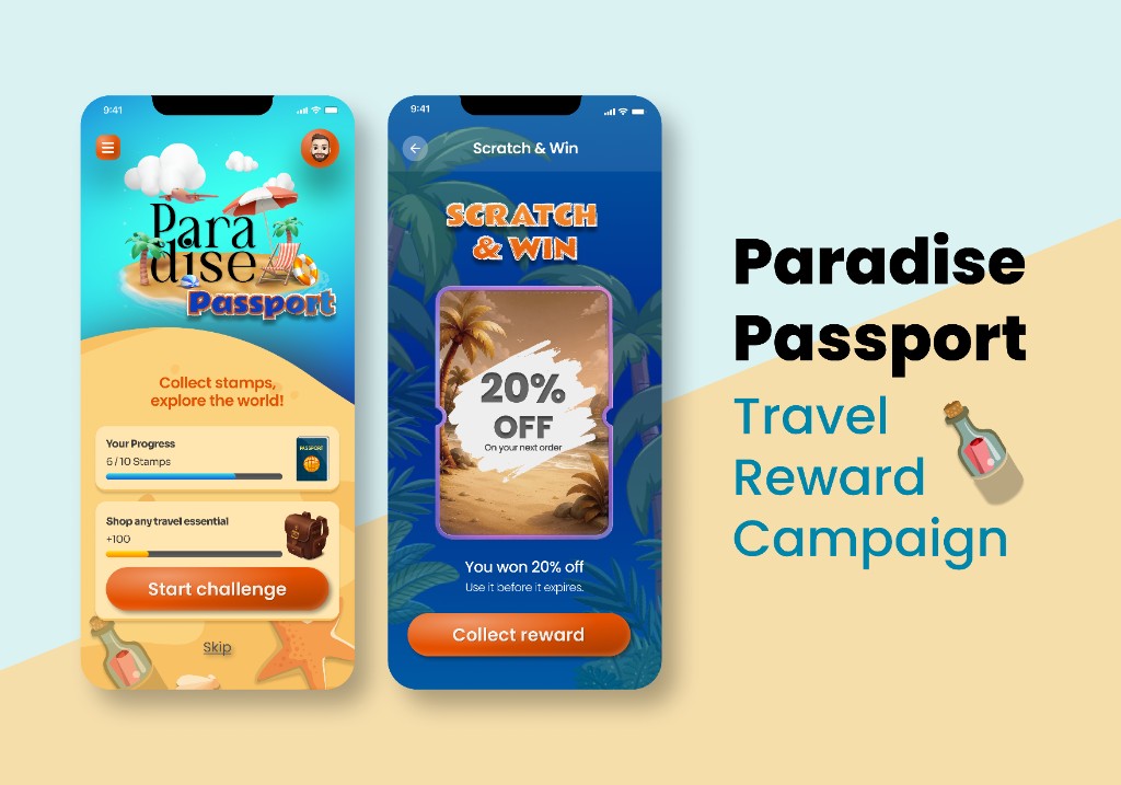
A travel-themed rewards campaign where collecting stamps feels like actually planning a trip. The concept was built around one insight: the most motivating loyalty mechanics are the ones that make progress visible and the destination feel real — not abstract points on a screen.
Color & Contrast
The palette runs warm: sandy beige for the lower content area, tropical teal and ocean blue for the hero, and a burnt orange (#C15A10) for all primary CTAs. This warm-to-cool split creates a natural visual zone — the illustration world lives at the top, the functional UI lives below — and gives users an immediate sense of place before they read a word. Orange CTAs against the sand background maintain a 4.8:1 contrast ratio, meeting WCAG AA, while standing out without competing with the illustration.
Typography
The logotype uses a display serif with hand-styled treatment to feel like a travel brand, not a loyalty program. This single typographic choice does heavy lifting: it sets the campaign tone, differentiates the experience from a standard app, and signals that what follows is a world to explore. All functional text — progress labels, challenge descriptions, CTA copy — returns to a clean sans-serif to keep usability sharp underneath the visual theatre.
Visual Hierarchy & Engagement Mechanics
The landing screen leads with the illustration world (emotional hook), then progress (personal investment), then the daily challenge (immediate action). This order is deliberate: you feel the destination before you’re asked to do anything. The scratch card screen does the opposite — it removes all context and focuses entirely on the reveal moment, using a single oversized reward value and one CTA. Surprise mechanics work best when nothing competes for attention at the moment of reveal.
Some assets and illustrations used in this project are sourced from Freepik.